Project Context
Mid-term Project for Human Computer Interface course (B.Tech Computer Engineering at NMIMS University)
Solo work
Responsibilities
- Research: User Interviews, Affinity Mapping
UX Design: Wireframing, Prototyping, Information Architecture
UI Design: Style guide
Tools
- Miro
- Figma
- Notion
Contact
email@domain.com
000-000-000
Problem Context
In a recent survey conducted on IIT-M students, it was found that 30% of the respondents faced depression, 17.45% faced problems with anxiety and 16% had suicidal thoughts, had attempted suicide or had inflicted self harm. Moreover, 53.37% of the respondents said that they had experienced some mental issue and 34.39% said that they were aware of the issues they were facing at the time.
These staggering findings shed little light on a much deeply-rooted issue. The pressure starts building right from the point the student enrolls in coaching classes for entrance exams. And thus starts a long strenuous journey from high-school to IIT. While coaching, most of these children are subjected to high pressure for long durations and in a lot of cases they are also expected to give up on other activities that they enjoy – all to focus on studies. Th
The Process
Research
I approached students who were preparing for highly competitive exams. And spoke to them at length about their daily schedules, studies, difficulties, hobbies, etc. This gave me an insight into their day-to-day activities and it also highlighted multiple pain-points. The pain-points led to further discussions surrounding what they wish was made available to them.
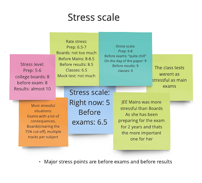
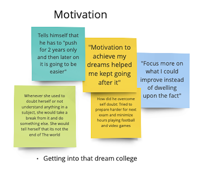
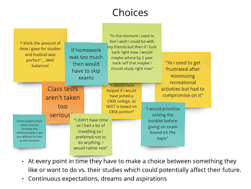
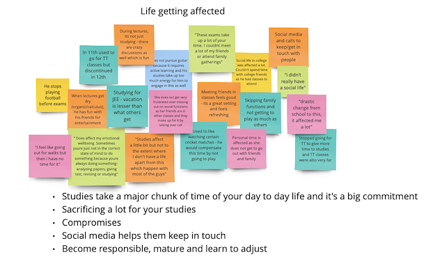
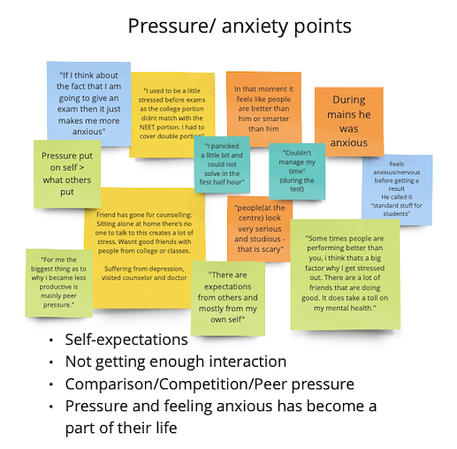
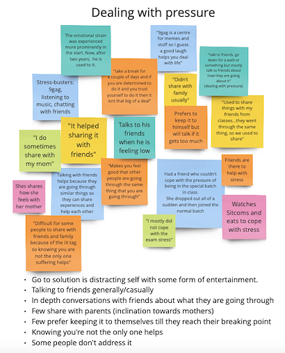
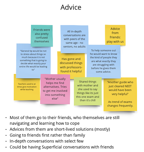
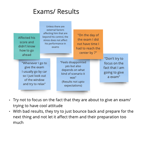
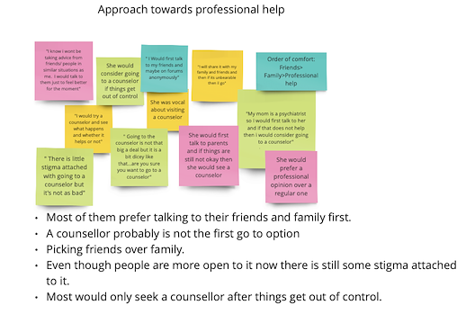
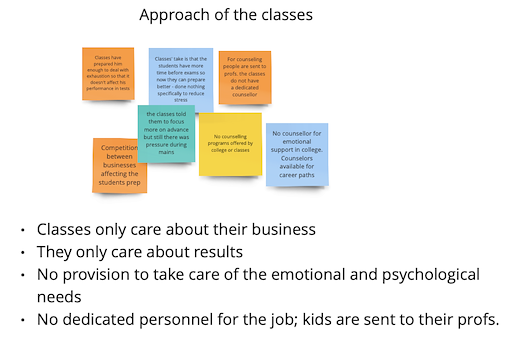
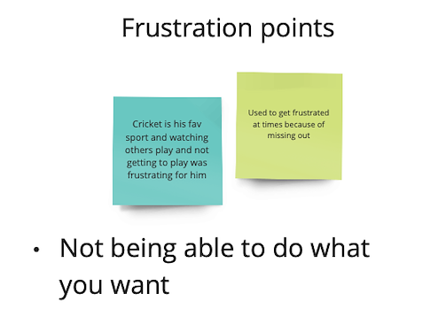
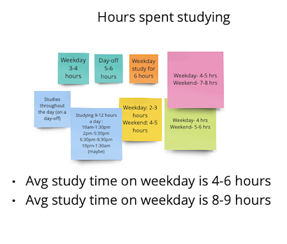
The 7 student interviews were recorded with the students' consent. After the interviews were conducted, I went back to the recordings of the interview and noted down the things that were of importance. Once these notes were made, they were organized in buckets creating an Affinity Diagram.
Next, these buckets were further analyzed for insights to clearly understand what each of them were telling us. That can be seen in the following images:
(Different colors indicate responses from different people. Tap on images to zoom in)
Defining the problem
The interviews were provided evidence for the fact that these students did not feel supported in their journey. The obstacles far outweighed the motivation and this eventually affected their performance. While some students thrived under pressure, for most, it was a very challenging period to say the least.
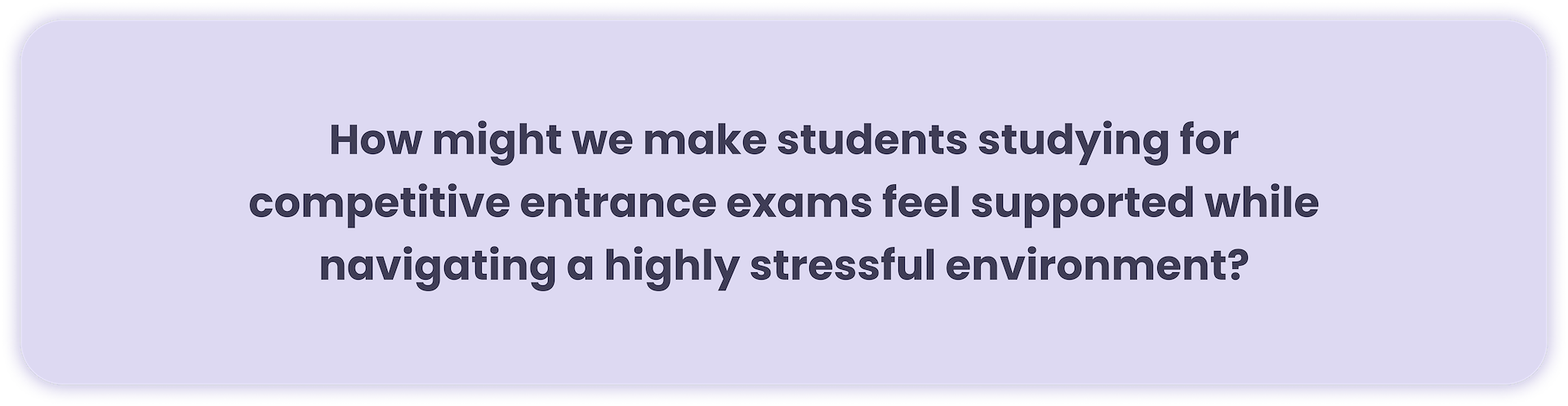
Based in the insights gathered, I defined the problem as:
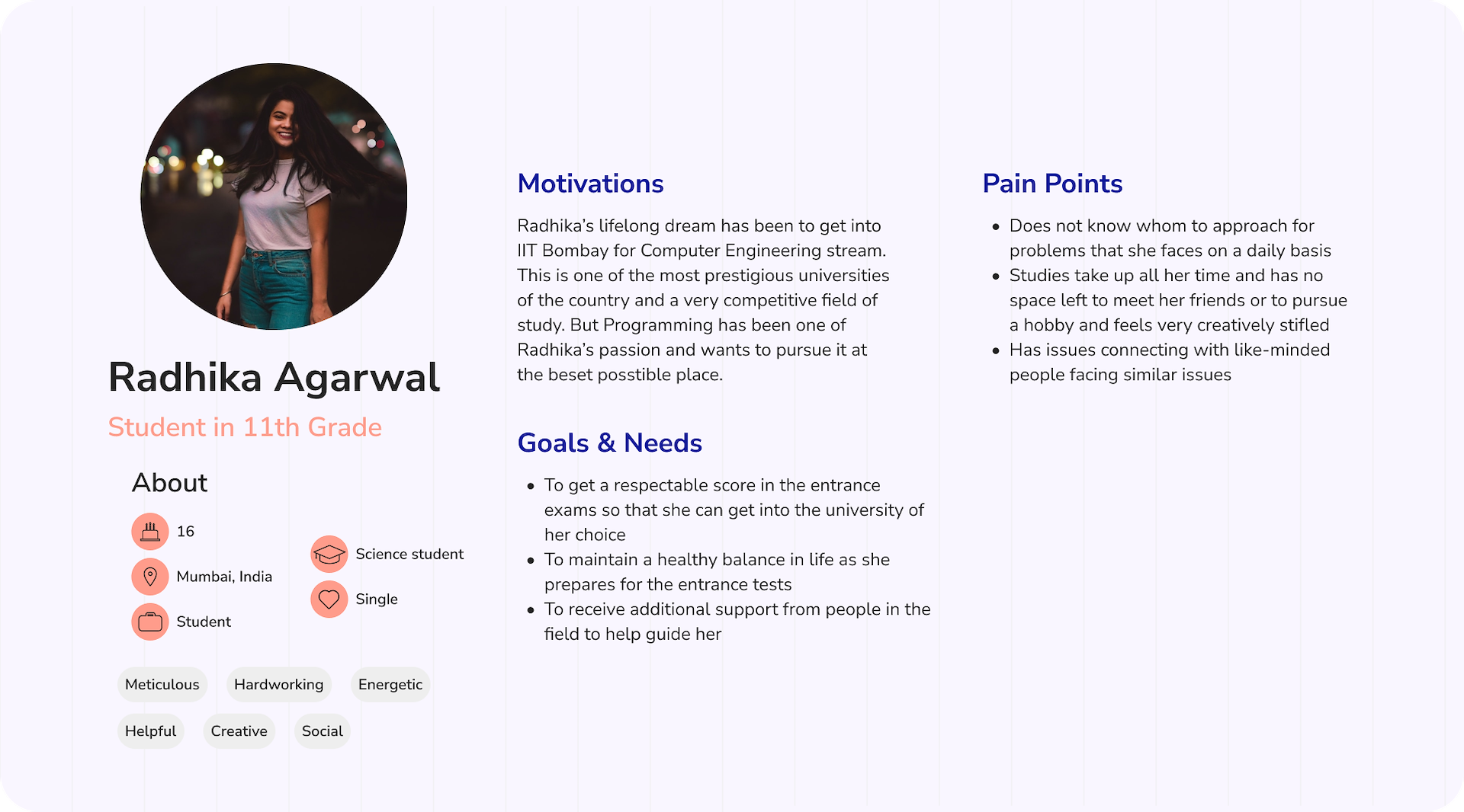
I also created a Persona based on the interviews that were conducted. This helped me create a reference and stay aligned with the target audience while making future design decisions.
Features Mapping
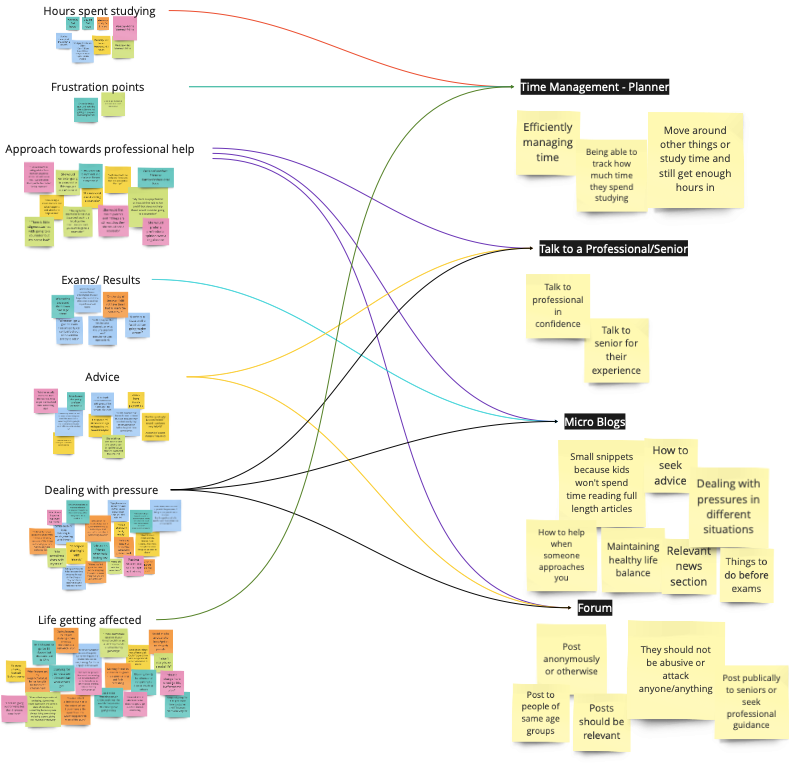
I picked the pain-points as identified during user research and started to brainstorm ideas on how those problems could be addressed. I also took into account some of the possible solutions that the students themselves had touched upon and built on that.
Below is a representation of how the problems correlates to features. I created this mapping so that I could make sure that I have covered the major pain-points in my solution.
Solution
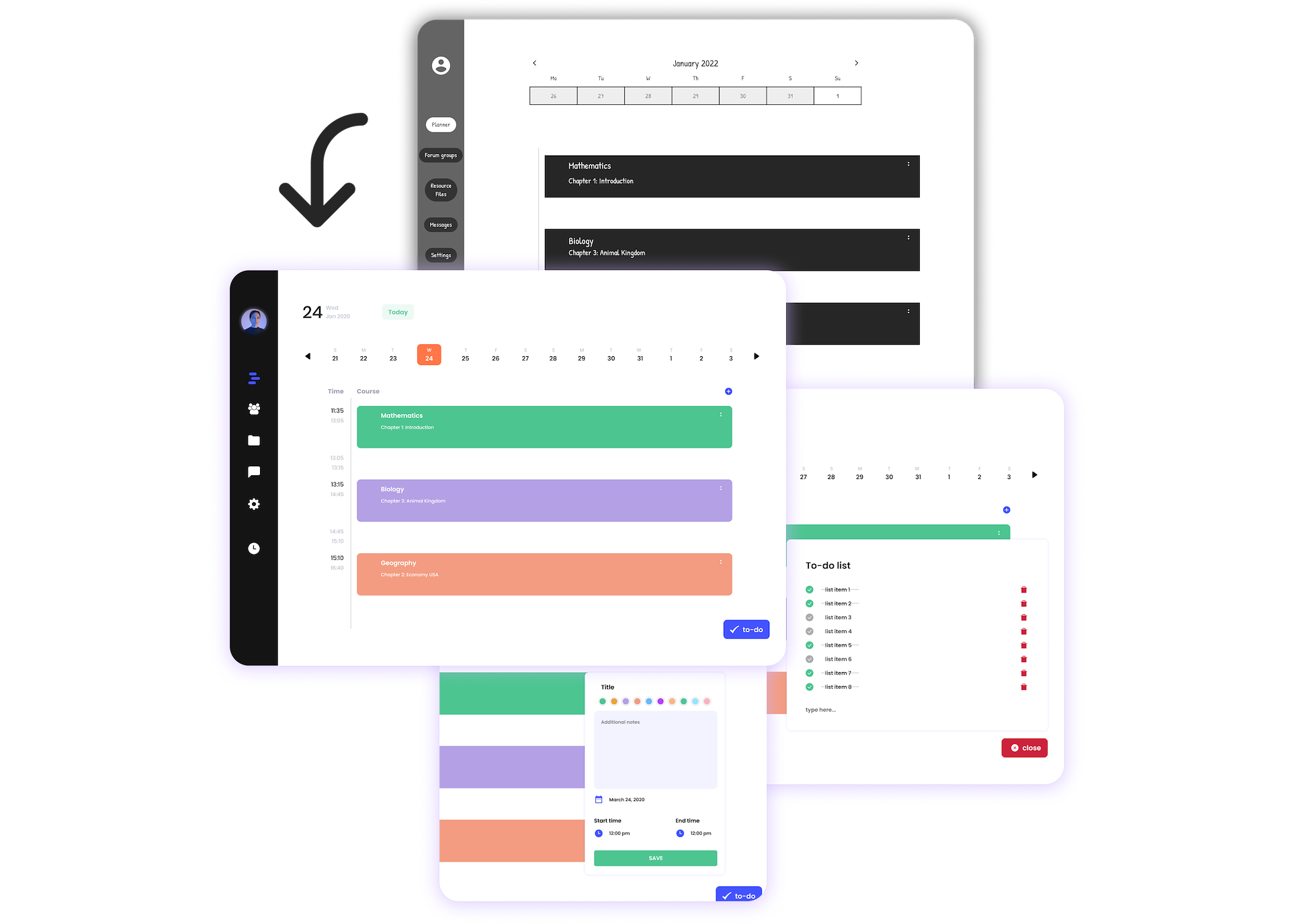
Now that I had the features listed, I started to design the solution. It began with some low-fidelity wireframes. I went back and forth a lot with respect to how I wanted the different sections arranged but finally settled on the design shown as follows. I wanted to make each of the sections equally accessible like tabs because I anticipated that students would have varying priorities as reasons to use this application.
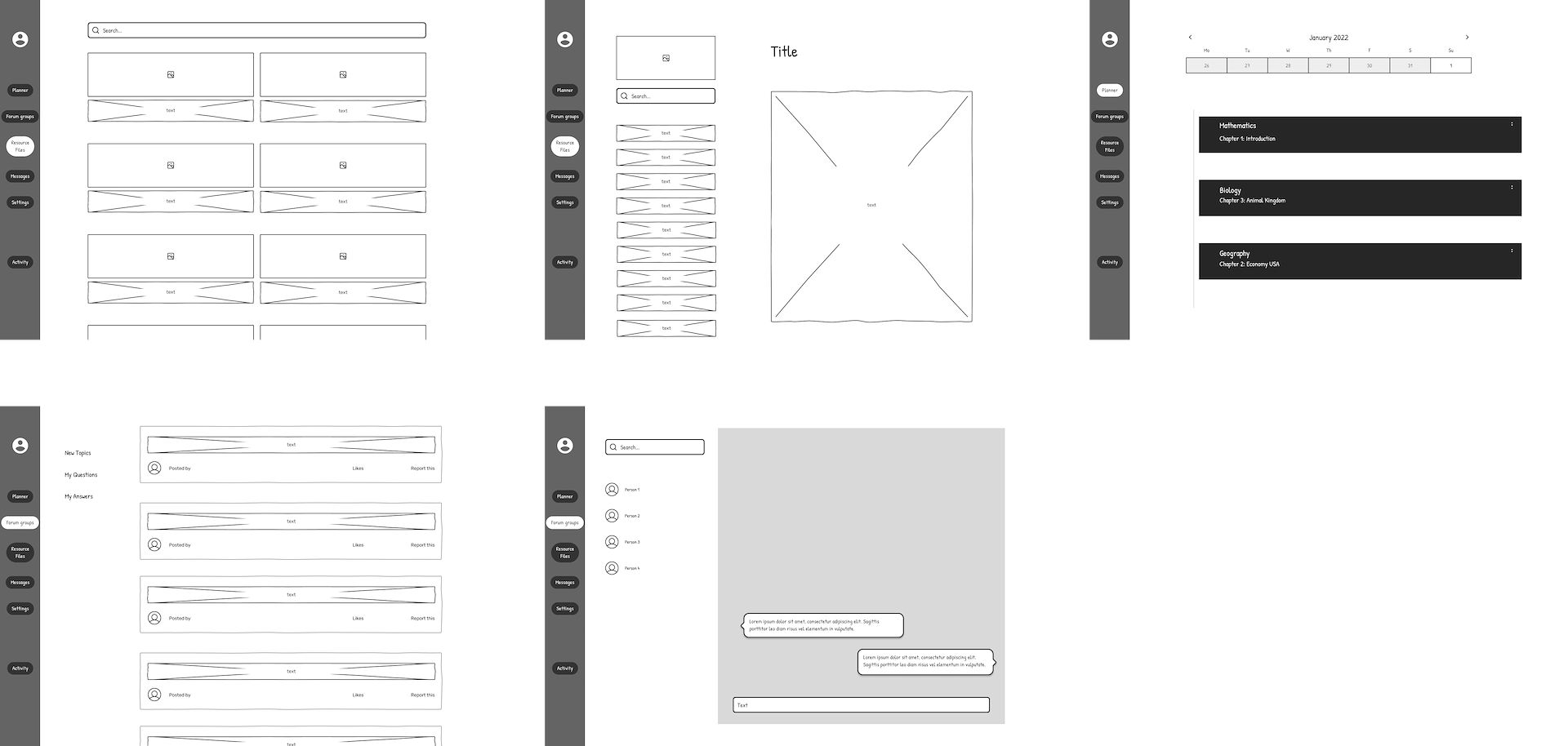
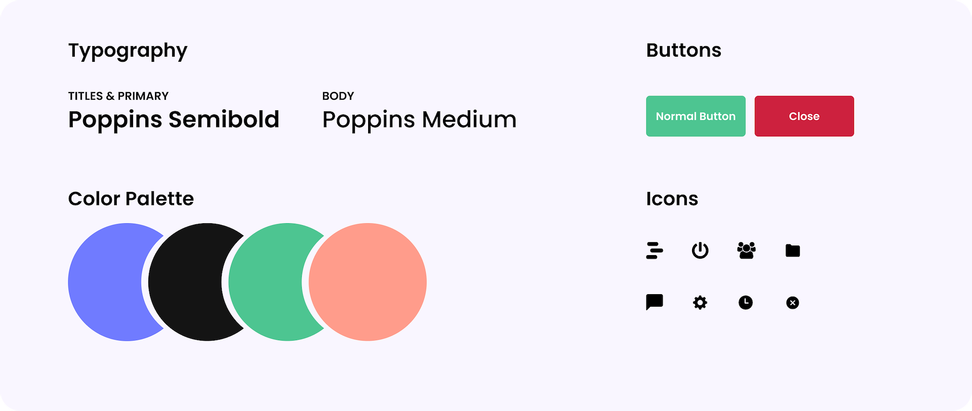
Next I created a style guide to help convert these wireframes into high-fidelity screens.
Planner – Yes, there are many planners that already exist. Some of the students also created time-table sheets that they would put up. But this smart planner takes in your efforts estimate and plans a balanced week with some breathing space and time to do what you love.
It's also flexible so that you can move things around with fluctuating workload such as "homework".
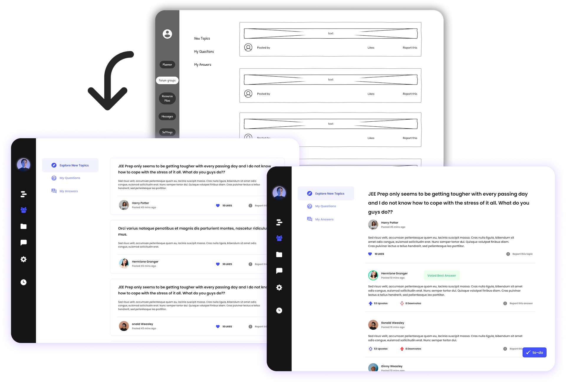
Forum – This moderated platform is specifically for the academic life. The moderated environment creates a safe space for discussion and a sense of community. There would also be expert profiles in the future that would bring valued inputs to the conversation from people who have gone through similar situations.
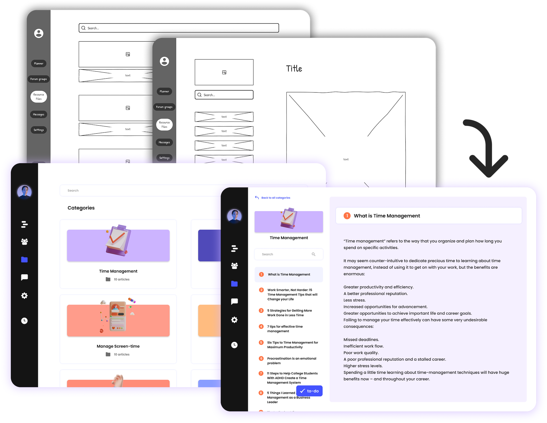
Resources – Students complained about information overload when they tried to look for resources themselves. For a simple search 100s of possible search results would pop up and they did not know which ones they should refer to. Obviously they couldn't look at all and there was always this fear that they would be missing out on something important. Vetted professionals would add resources to the platform. These could be blogs that they found useful or study material that the students can refer to. It would be like an information hub that would build over time.
Expert Chat – Students can connect with seniors on this platform to get tips and guidance from them on how they mitigated this stressful time in their lives.
Interactive Prototype
Play around with this prototype and click anywhere on the screen to reveal the clickable elements. (Desktop preferred for viewing)
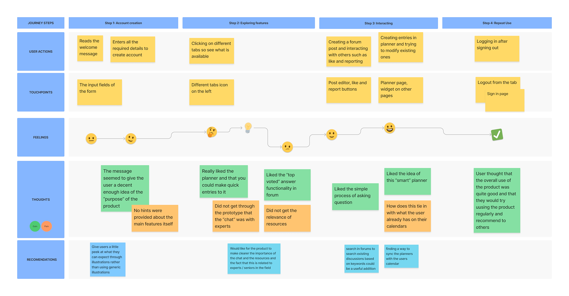
Testing
I tested the prototype with 4 potential users who had also participated in the user research earlier. This was a design prototype and not a developed product so the test functionality was limited. But I wanted to get their take on what was made so far and the future considerations for iterations.
Since there were constraints on the things that I cold test and the extent of testing, I created my own version of a journey map to summarize the findings from the usability tests.
Future Scope
For future development, I would take a look at some of the suggestions that were made such as – making the illustrations more meaningful, tying in the planner with the user’s calendar, making the importance of certain features more evident by providing more information of the “source” i.e. that certain information is coming from experts and implementing search.
In addition to this, I would also consider how notifications work. Since this is a website and not a native app, if the user is logged out, they could miss crucial notifications.